
The Anthropocene Loop
The Holocene has lasted 11,700 years. Modern climate change outlasts it.

By Dean Rovang
Staying Curious · justdean.substack.com · ORCID 0009-0006-1351-5320
Last April I published a figure that put carbon dioxide and global temperature on one set of axes — every reconstruction we have of the deep past, going back 66 million years, alongside the modern instrumental record — and showed that today’s combination sits outside the relationship that held for all of it. In that essay I posed a question I couldn’t answer. Will the system come back to that relationship? If it does, where on the curve, and how long after we stop emitting? What is the path, and what happens to us along the way?
This is my attempt at an answer.
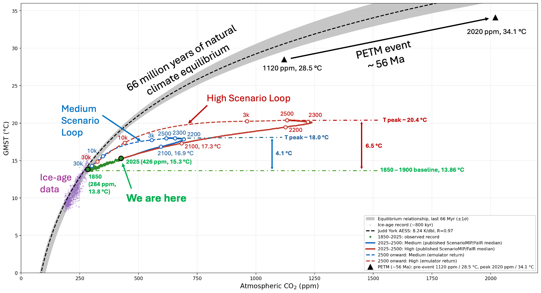
Carbon dioxide and global mean surface temperature, 66 million years of equilibrium and the excursion we are making through it. Green dots: the observed record, 1850–2025. Solid blue and red: the Medium and High scenario projections from van Vuuren et al. 2026 — the ScenarioMIP design for the next IPCC assessment cycle — plotted as the published FaIR-ensemble median. Dashed: the modeled return beyond 2500. PETM states from Tierney et al. 2022, shown for scale; the warming across that event is far better constrained than the absolute values, and comes from a different reconstruction than the band.
Start with what the gray band is, because everything else depends on it. Over the last 66 million years, the Earth settled into a consistent relationship between how much carbon dioxide was in the air and how warm the planet was. More carbon, warmer world, in a proportion that barely wavered across ice ages, hothouses, and the slow drift of continents. The band is that relationship, and the purple cloud inside it is the last 800,000 years of ice-age cycles doing exactly what the relationship says they should.
The green dots are us. They begin in 1850 at 284 parts per million and 13.8 °C, and by 2025 they have reached 426 parts per million and 15.3 °C — a degree and a half of warming, and a departure from a 66-million-year relationship that is not subtle and not gradual. That much is measurement. No model produced any part of it.
The colored lines are where it goes next, and here I have to hand off to other people’s work. The two solid curves are the published projections from the international scenario exercise that will feed the next IPCC assessment — a Medium pathway and a High one, each run through a standard climate emulator, each a median line through a wide range I haven’t drawn. The Medium pathway is roughly what current policy delivers. The High one is the upper bracket — its authors judged it plausible, made it their top priority, and are running it through Earth system models now.
It is worth saying plainly that these are not the old discredited scenarios. The authors of this exercise explicitly disown the highest of the previous generation — RCP8.5 and its successor — on the grounds that it has become implausible given the collapse in the cost of renewables and the emergence of real climate policy, and they designed their High pathway to fall below it. And you can see in the figure that neither pathway does anything exotic. They continue the arc the green dots were already tracing. Where the dots stop and the lines begin, there is no kink, no jump, no sudden steepening. Whatever else you want to argue about these scenarios, they are not a departure from what we have already measured.
Now notice where the solid lines stop. They stop at the year 2500.
That is not an accident or an oversight. The exercise runs its extensions out to 2500 deliberately, by which point emissions have reached net zero and temperature has leveled off, and the whole point of the design is to reach that stable state and stop. The published frame ends with the planet sitting at 18.0 °C in the Medium case and 20.4 °C in the High one, and holding there. Four degrees above preindustrial, or six and a half.
Nobody in that framework asks what happens next. That is the gap this essay is about.
What happens next is that the carbon comes out of the air, because it always does. The ocean absorbs it, then slowly neutralizes it against seafloor carbonate, and then over far longer stretches rock weathering removes the last of it. That sequence is well understood and it is very slow. The dashed lines trace it, using a simple carbon-cycle and energy-balance model I built and have documented in full, run continuously from 1750 and anchored to the published projections at 2500. What the model computes is the path and the timing — not whether the carbon leaves, which is imposed, but how long it takes and what the temperature does while it happens.
In May I published two versions of this loop. Their forward legs came from published projections; their returns I drew by hand, interpolating between anchor points from the literature and closing on the equilibrium curve at about ten thousand years. They assumed their destination. This one computes the return instead — which is why the number that follows is different, and why there are now two numbers rather than one.
The answer, for the Medium pathway, is about sixteen thousand years before the climate re-enters the band it left in 1850.
Sit with that number for a moment, because it is the one I would keep if I could keep only one. The Holocene — the warm, stable interval in which agriculture was invented, cities were built, writing appeared, and every civilization in the historical record rose and fell — has lasted 11,700 years. The Medium pathway, the one current policy actually delivers, keeps the climate outside its 66-million-year relationship for longer than that. Not the worst case. The middle one.
The High pathway takes roughly sixty-eight thousand years, because it carries about two and a half times as much excess carbon and the slow removal processes have that much more to work through. But I want to be clear that the argument does not need it. Throw the High scenario out entirely, and Medium alone still outlasts the epoch in which everything we call history happened.
One caveat belongs with both numbers. The exercise is candid that its post-2100 extensions are judged more loosely than its twenty-first-century pathways — on geophysical grounds alone. That is one more reason I would rather rest the argument on Medium.
And every simplification here runs the same direction. The scenarios assume no climate change impacts at all — nothing feeding back from a hotter world onto agriculture, ecosystems, or economies — and the authors are explicit that this assumption matters most in the high scenarios, where those impacts would be largest. The carbon-cycle response in these numbers is calibrated to the previous generation of climate models rather than to the spread of the current ones, and the scenario team says as much themselves: their full Earth-system results are still to come, and those will carry feedbacks the emulator leaves out. Tipping points are the largest of them. These are reduced-complexity emulator results, and the exercise itself assigns the risk of breaching thresholds in the slow parts of the Earth system to its long extensions as an open question.
Four degrees and six and a half are not the top of a range. They are the middle of a range computed without them — and the same is true of the sixteen thousand years.
The degree and a half already on the ground is the smallest part of this. Medium is nearly three times that; High is more than four. The most recent reconstruction of the mid-Pliocene, three million years ago, puts it at 4.1 °C above preindustrial — the number Medium reaches — and sea level then stood some twenty meters higher than today. High goes past that, into the Miocene. And a global average is an average over ocean and land: land has warmed about 1.4 times faster so far — 2.0 °C against the global 1.4 — so if that ratio holds, Medium adds something like 10 °F over land and High about 16 °F, on top of whatever your summer already is.
The only event in the whole 66-million-year record that resembles what we are doing is the black arrow in the upper right: the Paleocene–Eocene Thermal Maximum, 56 million years ago, when a vast quantity of carbon — mostly volcanic, on the current reading — entered the atmosphere over three to ten thousand years, and the planet warmed by 5.6 °C. Methane has long been suspected as a contributor, but methane survives about a decade in the air before oxidizing to carbon dioxide, so whatever the initial form of the release, carbon dioxide is what did the warming. That is why the PETM is the comparison worth making. It is the one case in the record where the forcing was the same gas, arriving suddenly, into a world otherwise going about its business.
So compare them in the plainest terms available. Tierney and colleagues put the PETM’s warming at 5.6 °C, with a 95% confidence interval of 5.4 to 5.9 — a tight number for something 56 million years old. The High pathway reaches 6.5 °C, and Medium — the pathway current policy actually delivers — reaches 4.1. So High produces more warming than the largest carbon-cycle event in the Cenozoic, and Medium produces about three-quarters of it. On the carbon side the comparison is looser, because the reconstruction constrains the relative change in carbon dioxide far better than the absolute one: the central estimate is a rise from about 1,120 to about 2,020 parts per million, but the plausible range for that increase runs from roughly 700 to 1,200. High adds about 850 parts per million, broadly comparable across all of it. Medium adds about a third as much as the PETM did.
One number runs the other way. Per doubling of carbon dioxide the PETM warmed 6.5 °C; High warms 3.3. The ancient world was more sensitive than ours. But that is Tierney’s argument, not a comfort — sensitivity climbs as the climate warms, and her more recent work finds it already elevated at Pliocene carbon dioxide levels much nearer our own. Their number is not a reassurance about us. It may be where ours is going.
One more asymmetry runs against us, and it is the rate. Tierney’s own conclusion is that the PETM was less abrupt than human-caused climate change. Their carbon took thousands of years to arrive. Ours is taking centuries.
Two things this figure does not say, and I would rather say them myself than have them pointed out.
The first is that the gap between our trajectory and the band is not a measure of how much warming is still owed to us. The band is where temperature settles once every slow feedback has finished — ice sheets, vegetation, the works. Our trajectory sits below it because we are moving faster than those feedbacks can respond, and the gap is the signature of that lag rather than a debt that comes due next century. A reader glancing at the figure might see a shallow modern slope against a steep ancient one and take comfort. That would be exactly backwards: the shallowness is the disequilibrium, and the loop is what it looks like when the system finally catches up.
The second is that a loop which closes in two coordinates does not mean the Earth comes back. Carbon dioxide returns and temperature returns, on the timescales drawn here. Ice sheets, sea level, ocean chemistry and the species that depended on the old arrangement do not. And because the temperature stays elevated for millennia rather than spiking and subsiding, the slow consequences are not cut short — they have all the time they need to finish.
It is worth saying plainly which part of this rests on what. That the change is real, and that it is ours, comes from the measurements and from reconstructions of the past — a departure from a relationship that held for 66 million years, beginning at the industrial onset and nowhere else in the record. Not one piece of that looks forward, and no projection is needed for it. That it is serious is the part that requires the projections and the model behind the dashed lines, because how hot and how long are questions about a future that has not happened yet. Three claims, three different kinds of evidence, and they should not be run together — including by me.
So here is where I get to. I have extended the published projections with a simple model, and published exactly what is imposed, what is calibrated, and what emerges from it, so that anyone can check the arithmetic or break it — the companion piece to this one will do that in full. I have also now built this loop two ways, once by interpolating between anchor points from the literature and once by computing the return from a carbon cycle and an energy balance. They disagree about the details. They agree about the length.
Which brings me to the number everyone stops at. Every target, every headline, every policy horizon ends at 2100. On the Medium pathway — the one current policy actually delivers — 2100 carries about three-quarters of the warming and half a percent of the duration. It is not the end of anything. It is a waypoint, seventy-five years into something that runs for sixteen thousand.
That is why the length is the serious part and not a footnote to the temperature. A hot century is something a civilization endures. A hot sixteen thousand years is something the ice sheets and the ocean have time to answer in full, because nothing arrives to cut the answer short. The Pliocene is what that looked like the last time the planet sat at this temperature: a sea some twenty meters higher than the one we built our cities on.
The Holocene lasted 11,700 years, and everything we call history happened inside it. We are choosing something longer.
Sources
The equilibrium band — how it is built, which fits go into it and which were left out — is defined in Checking My Own Work, together with the audit behind those choices. The data, the scripts and the manifest go to any reader who asks.
Band: Judd et al. (2024), Science 385, eadk3705. EPICA Dome C temperature, Jouzel et al. (2007), Science 317, 793, with carbon dioxide from Bereiter et al. (2015), Geophysical Research Letters 42, 542. Clark et al. (2024), Science 383, 884.
Modern record: Berkeley Earth global mean surface temperature, with carbon dioxide from the CMIP6 historical concentrations (Meinshausen et al. 2017) spliced to the NOAA GML globally averaged marine-surface annual mean.
Scenarios: van Vuuren et al. (2026), Geoscientific Model Development 19, 2627, distributed under CC BY 4.0. The FaIR-median trajectories are the paper’s own figure data, MIT-licensed, at Zenodo 10.5281/zenodo.14382495.
PETM: Tierney et al. (2022), PNAS 119, e2205326119. Mid-Pliocene: Tierney et al. (2025), AGU Advances 6, e2024AV001356 — 4.1 °C above preindustrial, 95% CI 3.0–5.3, warmer than the PlioMIP2 average and the AR6 assessed range. Pliocene sea level: Dutton et al. (2015); Grant et al. (2019).
Holocene: 11,700 years is the formally ratified base of the Holocene — Walker et al. (2009), Journal of Quaternary Science 24, 3, dating the GSSP in the NGRIP ice core to 11,700 calendar years before AD 2000, with a maximum counting error of 99 years.
The carbon-cycle and energy-balance model behind the dashed lines is documented in full in a companion piece to follow.
Excellent piece.
When it comes to understanding the climate crisis the Holocene is key.
Before 12 thousand years ago the highest estimates put the total global human population at 300 thousand.
After the beginning of the Holocene and in the geological blink of an eye, we’re now at 8 billion.
Let's say that, by some miracle, we reach net-zero in 2050. What will global temperatures be in 2100 and 2200?