
Checking My Own Work
Before this diagram went in front of a national audience, I held it to the standard I’d want to hold anyone else’s.

Dean Rovang - Staying Curious · justdean.substack.com · ORCID 0009-0006-1351-5320
Before I put this diagram in front of a national audience, I went back and checked it — every number, against the published source it came from, the way I would want to check anyone else’s work. Most of it held. A few things didn’t, and this is the story of what I found, what I changed, and why fixing it left the answer essentially where it started.
The diagram’s heart is a band: the relationship between carbon dioxide and global temperature, traced across 66 million years and reconstructed from independent archives — deep-ocean sediments, Antarctic ice, geochemical proxies. The band is the part that carries the argument, so the band is what I checked hardest.
Some of the checking just confirmed the work. The modern rise in CO₂, for instance, I had drawn from a reputable compilation; I replaced it with the community-standard series — the CMIP6 historical concentrations, spliced to the NOAA global mean for recent years — then rebuilt that curve a second way, from raw records, to be sure the two agreed. They did, to about one part per million. Nothing moved — but now there are two independent roads to the same curve, and a reader can walk either one.
One thing did not survive the check.
The paleoclimate part of the diagram is anchored by regressions — lines fit through the reconstructed points, whose slope says how much warming accompanies each doubling of CO₂. I had five. One of them, fit to the Antarctic ice-core record, gave a perfectly ordinary slope, right in the family of the others. But when I tried to regenerate that number from the primary data the way I had cited it, I couldn’t. The recipe I had written down didn’t reproduce the line.
That is the kind of discrepancy easy to wave off, because the number was fine and nothing rested on it. I retired it instead. If I can’t rebuild a number from its stated source, it has no place in a diagram whose whole promise is that you can. I kept a more robust version of the same regression — one that accounts for uncertainty in both quantities — which lands in the same place.
What remained were four regressions, each on an independent record:
● Judd and colleagues’ 66-million-year reconstruction — about 8.2 degrees per doubling, and the tightest of the four.
● The EPICA Dome C ice core — about 8.8.
● Clark and colleagues’ compilation — about 9.0.
● Snyder’s reconstruction — about 9.9.
Three agree closely. The fourth, Snyder, runs hotter, and I set it aside when drawing the band. That was a judgment call, so I want to make it in the open — and the clearer of my two reasons is the one about where a record has the right to speak.
Three of the four — EPICA, Clark, and Snyder — are built from ice-age CO₂, which never rose above about 300 parts per million. Above that level, every one of them is extrapolating: extending a line past its last data point and trusting it to hold. Judd’s reconstruction is the exception. It carries actual data up to roughly 1,300 ppm — into the hot, high-CO₂ world of the deep past, which is the direction we are now traveling. So at high CO₂, Judd is not one vote among four; it is the only record still measuring, and it deserves the heavier weight. Snyder, up there, is a hot line drawn out over no data, pulling away from the one record that has some. Letting it set the warm edge of the band would move that edge away from the evidence, not toward it.
There is a second, more technical reason Snyder runs hot — a larger reconstructed swing between ice ages, and a method that credits that whole swing to CO₂ when much of it was driven by slow ice-sheet and dust feedbacks moving in step with CO₂. But the simple version is enough: give the most weight, at any given CO₂ level, to the record that actually has data there. Snyder runs hot on an extrapolation; Judd anchors the warm end on data. The band follows the data. And the rule cuts both ways — I would set aside a record that ran cold of the others for the same reason.
One choice about the Judd data warrants a note. Judd and colleagues reconstructed CO₂ and temperature across the entire Phanerozoic — the past 485 million years — and I use only its most recent interval, the Cenozoic: the last 66 million years. The reason is not that this interval yields a cleaner correlation, but that it is the one in which the Earth was configured much as it is today, with continents and oceans in roughly their present arrangement, so that CO₂ and temperature are compared under boundary conditions resembling our own. Earlier intervals introduce a materially different planet — the supercontinent Pangaea, a different ocean circulation, a fainter sun. As with setting Snyder aside, this is a stated criterion rather than a convenience, and the earlier data remain in the same file for anyone who wishes to examine them.
The band itself is then just the envelope of the three remaining fits, each widened by its own uncertainty in slope. Where those three lines reach, the band reaches.
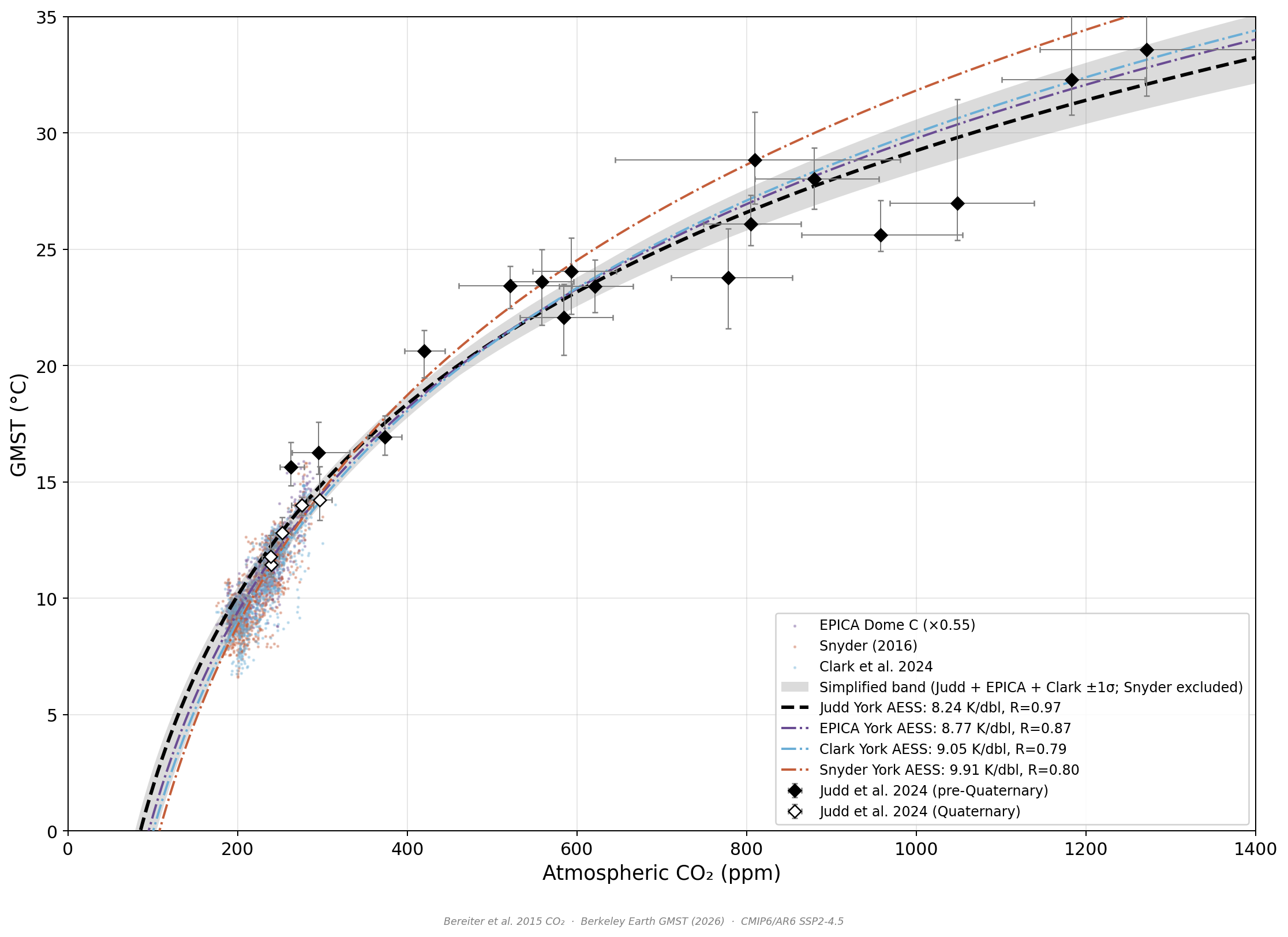
The four regressions and all of the Cenozoic Judd data — the last 66 million years — across the full range. The gray band is the envelope of the three agreeing fits — Judd, EPICA, Clark — each widened by its slope uncertainty; Snyder is shown but set aside. Above ~300 ppm the ice-core fits extrapolate, while Judd carries data all the way to ~1,300 ppm.
Here is what surprised me. After the retired line, the switched source, the set-aside record, the band barely moved — still roughly 8 to 9 degrees per doubling, essentially where it had always been. The check did not rescue a shaky argument; it hardened a sound one. That is more reassuring than a dramatic correction would have been: nothing important ever depended on the parts I had to fix.
One more thing, because it explains what you’ll see next. In the essays that follow, this band appears not as four labeled lines but as a single gray swath. That simplification is deliberate — it is drawn for readers who want the picture without the regression bookkeeping. This essay is the version with the hood up; the next is the same engine, closed and cleaned for the road. Both show the same thing.
A last honest note. The band is an equilibrium relationship — where temperature settles once the slow parts of the climate finish responding — not a path the world follows year to year. The modern record departs from it not because the relationship broke, but because those slow responses take centuries to millennia. That gap is the subject of the next essay.
What the check finally buys is one unglamorous thing: you can rebuild this yourself. Every dataset is a published file with a citation, and the steps that turn those files into the band are scripts anyone can run. The whole folder — data, scripts, and a manifest — is yours for the asking: regenerate the figure from scratch, or build your own from the same sources and compare. That is the only authority the diagram claims — and, I think, the only kind worth having.