
The 10,000 Year Anthropocene Loop
What the deep past and the deep future tell us about the journey ahead

Dean Rovang · substack.com/@deanrovang · ORCID: 0009-0006-1351-5320
Abstract
The CO₂-temperature diagram introduced in my previous posts showed where we are — a combination unprecedented in 66 million years. This post shows where we are going and how long it takes to get back. A handful of scientists have looked far past 2100 into the deep future. Their collective findings — Zickfeld (2013), Clark (2016), Summerhayes (2024), Tierney (2022, 2025) — have not previously been synthesized into a single visual connected to the paleoclimate record. The result is what I call the 10,000 Year Anthropocene Loop: the trajectory humanity is imposing on Earth’s climate system, from the industrial departure at 1850, through the SSP2-4.5 endpoint at 2100, around the U-turn after net-zero, and back toward geological equilibrium over millennia. The loop is long, the uncertainty grows with time, and the direction is not in doubt.
Author’s Note
My previous posts focused on what the paleoclimate record shows about where we are — a CO₂-temperature combination unprecedented in 66 million years. Most climate science communication does the same, understandably focused on near-term signals and the next few decades of forcing.
These are all legitimate and important. But a handful of scientists have looked further — past 2100, past 2500, into timescales that dwarf recorded human history. Zickfeld and colleagues showed in 2013 that CO₂ remains elevated for centuries after net-zero and temperature barely budges for a very long time. Clark and colleaguesshowed in 2016 that decisions made in the next few decades lock in consequences for the next 10,000 years. Summerhayes and colleagues examined in 2024 what the geological record tells us about where the current perturbation sits in the context of Earth’s deep history. Tierney and colleagues have shown that climate sensitivity itself is state-dependent — higher in warmer worlds, with the Paleocene-Eocene Thermal Maximum suggesting values approaching 6.5°C per doubling.
No one has put these findings together visually in a single figure that connects directly to the paleoclimate diagram. That is what Figure 1 attempts.
I. The 10,000 Year Anthropocene Loop
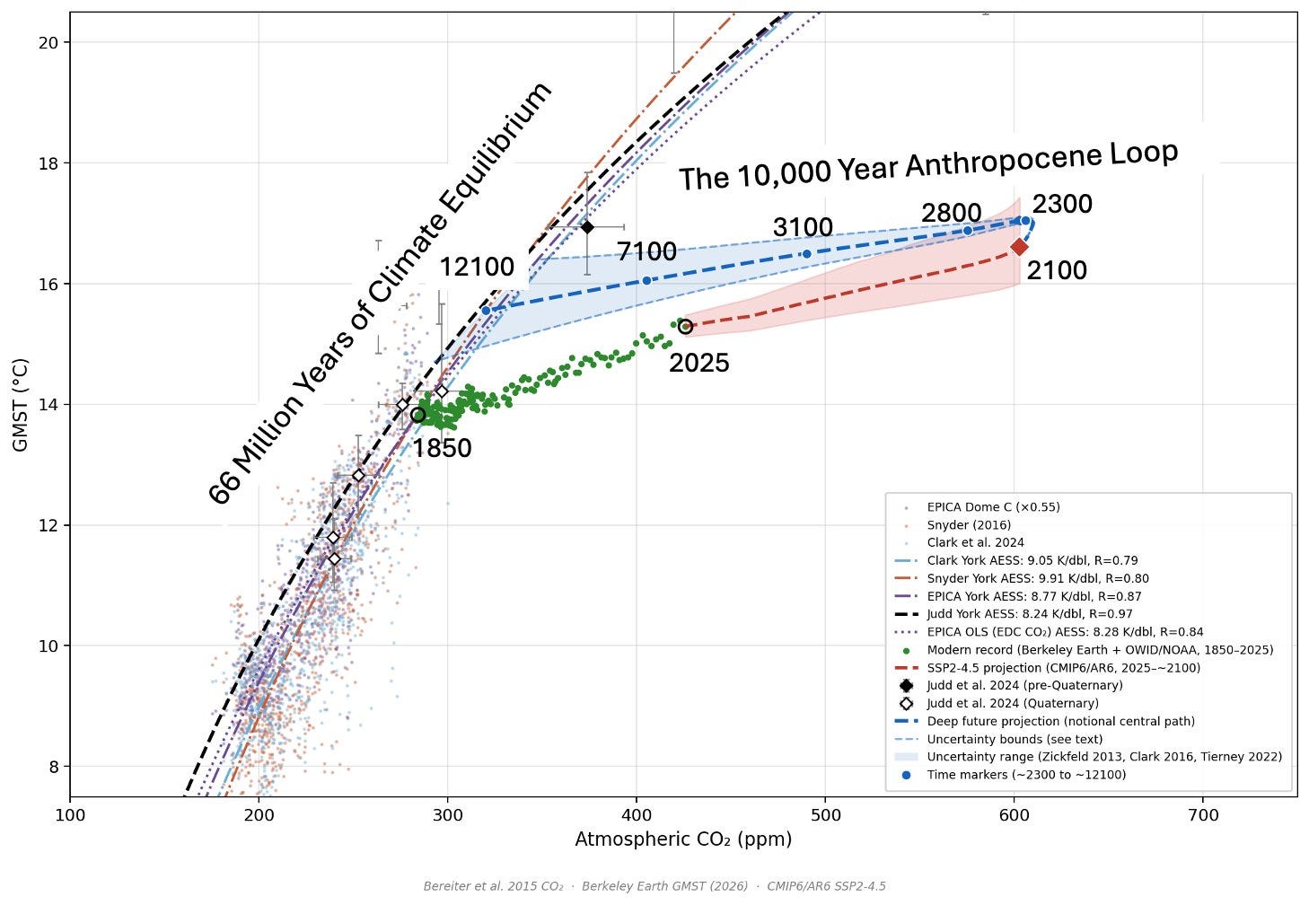
Figure 1. The 10,000 Year Anthropocene Loop. The paleoclimate CO₂-temperature diagram extended into the deep future. The red diamond marks the SSP2-4.5 endpoint at 2100 (~600 ppm, ~17°C). The dashed blue path traces the notional return journey grounded in Zickfeld (2013), Clark (2016), Summerhayes (2024), and Tierney (2022, 2025). The widening uncertainty band reflects growing uncertainty at longer timescales — state-dependent climate sensitivity, tipping points, and carbon cycle feedbacks. The fits define the paleoclimate equilibrium band toward which the system navigates. Date stamps: 2300, 2800, 3100, 7100, 12100. Source: Rovang (2026).
Figure 1 extends the CO₂-temperature diagram from my earlier posts into the deep future. The geological record occupies the lower left — 66 million years of Earth’s climate history, showing the tight relationship between CO₂ and temperature across five independent datasets. The modern record departs from that relationship at the 1850 hinge point, racing right and upward along the industrial trajectory. The red SSP2-4.5 projection carries that trajectory forward to the 2100 endpoint — roughly 600 ppm and 17°C.
From there, the loop begins.
After net-zero, natural carbon sinks — oceans, vegetation, rock weathering — begin drawing CO₂ down. Temperature, held aloft by the thermal inertia of the oceans, does not fall immediately. The system continues warming briefly even as CO₂ stabilizes and begins to decline — the top of the loop. This committed warming from existing forcing is documented in Zickfeld et al. (2013) and represents mainstream scientific understanding of post-net-zero dynamics. Additional warming from aerosol unmasking — a physically plausible but contested mechanism in which particulate pollution from fossil fuel combustion, currently masking some warming, disappears quickly once emissions cease — could push the loop top higher and contributes to the upper bound of the uncertainty fan.
The widening band around the central path reflects genuine and growing uncertainty. At short timescales the physics is relatively well constrained by Zickfeld’s multi-century simulations. At millennial timescales, Tierney’s finding that climate sensitivity rises in warmer worlds, combined with Clark’s documentation of tipping points and nonlinear feedbacks, means the range of possible outcomes grows substantially. The uncertainty doesn’t begin after 2100 — it is already present in the SSP temperature spread at the starting point — but it compounds from there.
The dots along the path are date stamps: 2300, 2800, 3100, 7100, 12100.
Let those numbers sit for a moment.
One important caveat: Figure 1 shows a single loop anchored to the SSP2-4.5 scenario — a medium pathway aligned with current policy. The starting point of the loop at 2100 carries its own substantial scenario uncertainty. Higher-emission pathways would push that endpoint further right and higher, launching a wider and warmer loop; lower-emission pathways would start the return journey earlier and cooler. The new ScenarioMIP-CMIP7 framework (van Vuuren et al. 2026) explicitly extends projections to 2500 AD to study long-term irreversibility — recognizing that the choice of emissions pathway determines not just where the loop starts but how long the return journey takes. The sensitivity uncertainty shown in the fan is layered on top of that scenario uncertainty, not instead of it.
II. The Scale of the Loop
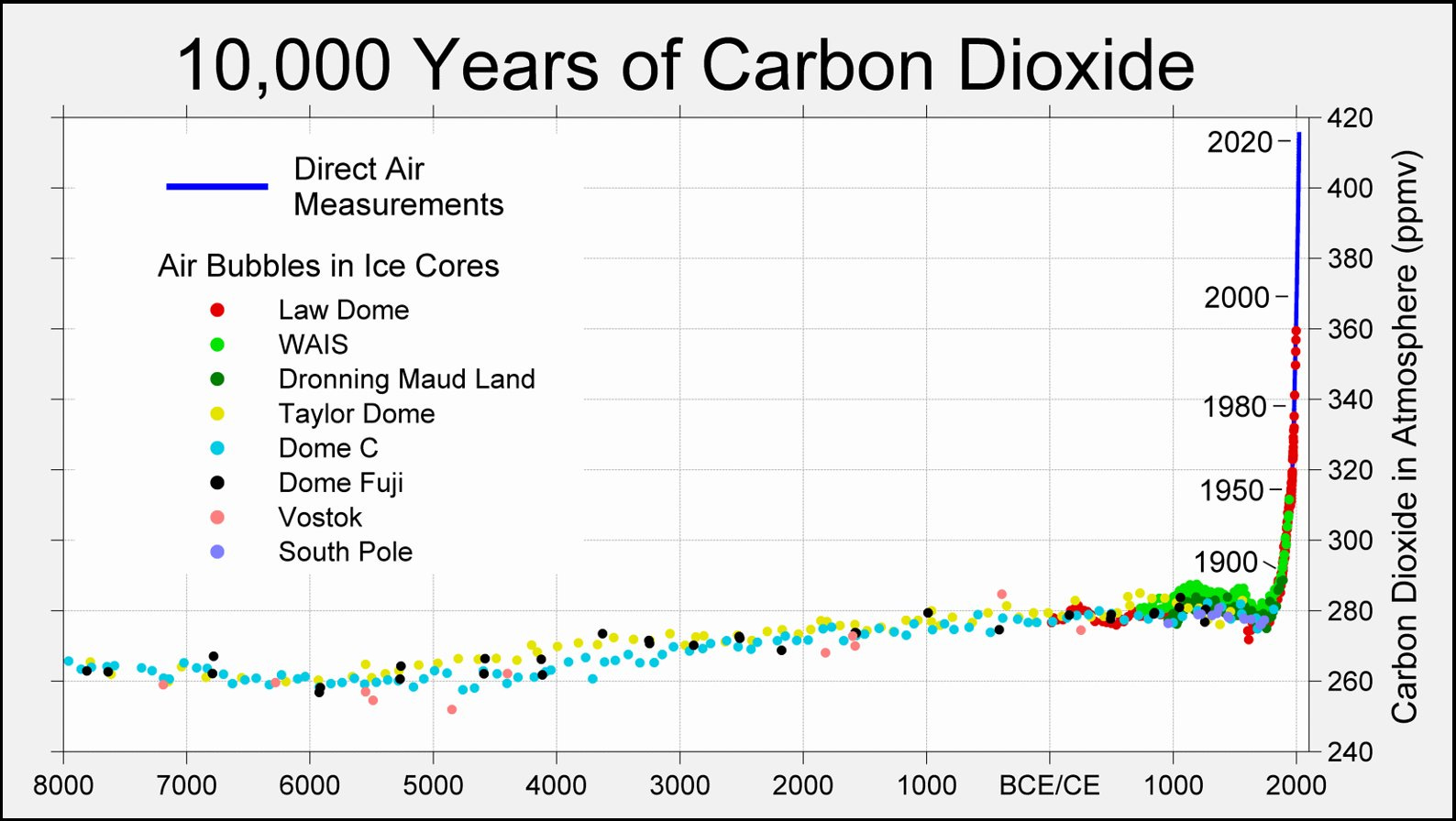
Figure 2. 10,000 years of atmospheric CO₂ from ice-core measurements and direct air measurements. For most of human civilization, concentrations remained near 260–280 ppm before rising sharply in the industrial era. Source: Berkeley Earth Data Visualization.
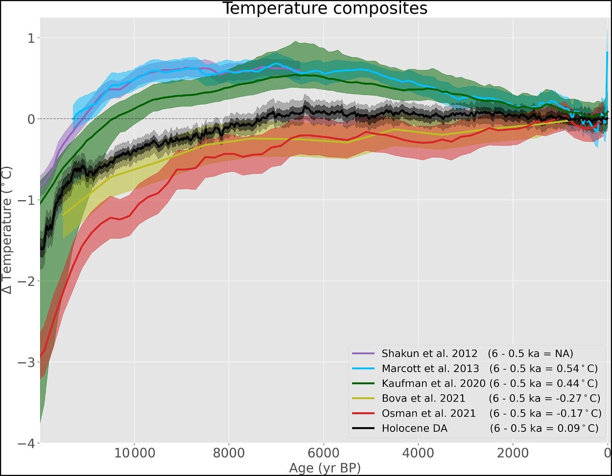
Figure 3. Holocene global mean surface temperature reconstructions from multiple independent research groups. Natural post-glacial warming and relative stability preceded the rapid modern rise. Source: Erb et al. (Climate of the Past, 2022).
These two figures show 10,000 years of atmospheric CO₂ and global temperature during the Holocene — the geological epoch that encompasses all of recorded human civilization.
For roughly ten millennia, CO₂ remained between 260 and 280 parts per million. Global temperature varied by less than 1°C. The entire arc of human history — the development of agriculture, cities, writing, science, industry — unfolded within that narrow band of climatic stability. The modern rise appears as a near-vertical line at the far right of each figure, barely visible as a separate feature at this scale. It happened that fast.
Now return to the date stamps on Figure 1.
The distance from today to 12100 is roughly 10,000 years — exactly as long as the Holocene stability shown in Figures 2 and 3. The loop from the 2100 endpoint back toward the paleoclimate equilibrium band takes as long as all of recorded civilization. Every society humanity has ever built fits between the left edge of those figures and today. The loop back takes equally long — and that is the central estimate.
The 10,000 Year Anthropocene Loop describes the time for the system to approach the CO₂-temperature equilibrium band — not to return to pre-industrial conditions. Summerhayes et al. (2024) put the fuller picture plainly: even if net-zero were achieved immediately, elevated global temperatures would persist for at least several tens of millennia. Closing the loop back to 1850 conditions takes far longer than getting back to equilibrium.
This is not rhetoric. It is a direct consequence of the carbon cycle physics documented by Zickfeld and the slow feedback timescales documented by Clark. The climate system has a long memory, and we are in the early stages of an experiment whose full consequences will not be expressed for thousands of years.
III. The Structure of the Loop
The loop in Figure 1 is not just a visual device. It represents a real physical process — the gradual transition of the climate system from its fast-feedback equilibrium toward its full geological equilibrium. The sensitivity concepts referenced below — ECS, ESS, and AESS — are defined precisely in Table 1 in the following section. The journey has a rough structure, anchored by the science of our four key authors.
Years 0–200 post-net-zero (Zickfeld)
Fast feedbacks have largely operated. The system is near its ECS destination for current CO₂. But CO₂ is still elevated — above 50% of peak even at year 700 in Zickfeld’s simulations. Temperature remains high. Natural sinks are drawing CO₂ down but slowly. Sea level rise continues as ice sheets respond to warming already locked in. The top of the loop is in this zone.
Years 200–1,000 (Clark et al.)
Significant ice sheet response begins. Greenland and potentially West Antarctic ice sheets are responding to the forcing already applied. Clark and colleagues showed that these responses lock in sea level rise of meters to tens of meters over this timescale — consequences that persist for 10,000 years regardless of what happens to emissions after net-zero. Vegetation shifts at high latitudes. The deep ocean continues warming. The system is moving through ESS territory.
Years 1,000–10,000 (Summerhayes, geological context)
The system approaches but does not reach full AESS equilibrium. CO₂ has declined substantially as natural sinks operate over geological timescales — silicate weathering, ocean carbonate chemistry, biological productivity. Temperature follows CO₂ downward, but slowly. How close the system gets to the paleoclimate equilibrium band depends on how long CO₂ stays elevated and how far the slow feedbacks have operated by then.
The key uncertainty: How quickly do the slow feedbacks operate? The geological record — the Pleistocene ice age data sitting on the paleoclimate equilibrium band — suggests the system can approach AESS on timescales of 10,000–100,000 years, perhaps faster than theory implies. That is the puzzle at the heart of what makes the loop’s endpoint uncertain.
IV. A Taxonomy of Sensitivity
Having traced the physical structure of the loop, it helps to be precise about what scientists mean when they talk about climate sensitivity — the concepts referenced throughout the previous section. The word covers several distinct concepts, each correct for a different timescale. Table 1 lays them out.
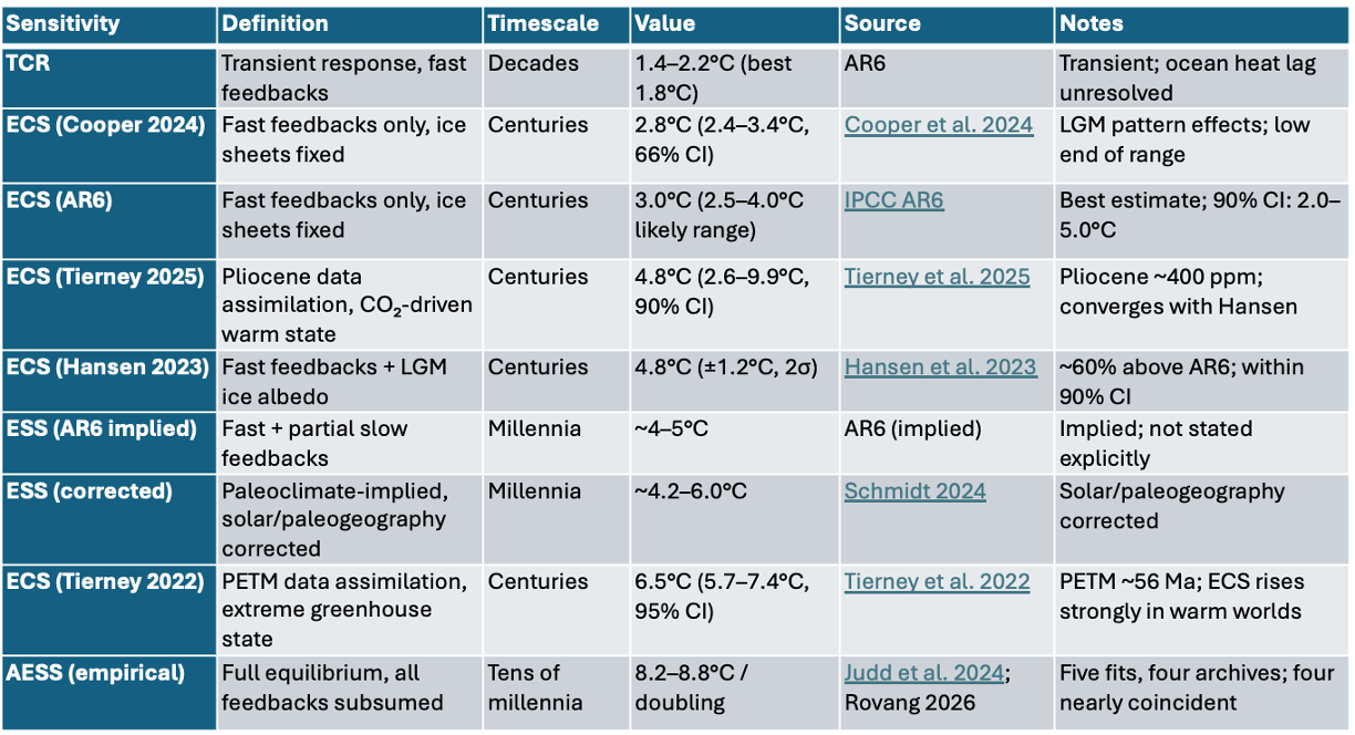
Table 1. The full landscape of climate sensitivity across timescales. Each measure answers the question “how sensitive is the climate?” correctly for a different timescale. Hansen’s ECS of 4.8°C sits roughly 60% above the AR6 best estimate of 3.0°C — above the likely range (2.5–4.0°C) but within the 90% uncertainty envelope (2.0–5.0°C). Tierney et al. (2025) independently derive 4.8°C from Pliocene data assimilation — a CO₂-driven warm state not affected by orbital contamination. Tierney et al. (2022) find ECS of 6.5°C at PETM temperatures, confirming that ECS rises substantially in warmer worlds. Cooper et al. (2024) constrains ECS to 2.8°C via pattern effects, consistent with AR6.
The table tells a clear story about where the scientific consensus sits — and where it may be underestimating. AR6’s best estimate of 3.0°C for ECS is well-constrained by multiple lines of evidence, including Cooper et al. (2024) at 2.8°C. But Tierney’s Pliocene result of 4.8°C — derived from exactly the kind of warm, CO₂-driven climate state that avoids orbital contamination — sits at the upper end of AR6’s 90% range and raises the question of whether ECS itself is state-dependent in ways AR6 hasn’t fully captured. Hansen’s ECS of 4.8°C, derived independently from LGM analysis, converges on the same number — a coincidence worth noting. The gap between AR6’s implied ESS (~4–5°C) and the empirical AESS (~8.2–8.8°C) is real, substantial, and not fully explained. That gap — roughly 3–4°C per doubling attributable to slow feedbacks that current models don’t fully capture — is where the deepest scientific uncertainty lies.
Gavin Schmidt’s analysis of the Miocene record (RealClimate, 2024) is important context. When you correct the raw paleoclimate regression for solar irradiance changes and paleogeographic effects, the implied ECS from deep-time data comes into alignment with AR6 — roughly 3.5–4.2°C per doubling. The raw AESS looks high partly because it subsumes effects that shouldn’t be counted as CO₂-driven feedbacks. But even after those corrections, the gap between the corrected ESS and the empirical AESS remains. Something is still unexplained — and that unexplained residual is part of what makes the upper bound of the loop scientifically serious.
V. The AESS Mystery
The most scientifically interesting feature of the diagram is also the most puzzling. The empirical AESS — approximately 8.2–8.8°C per doubling — appears consistent across climate states that should produce very different sensitivities.
The sensitivity table crystallizes the puzzle. ECS rises substantially in warmer worlds — from ~3°C today to 4.8°C in the Pliocene to 6.5°C at the PETM. Yet AESS appears roughly constant across those same climate states. The two measures are moving in opposite directions. Something in the slow feedbacks must be compensating — weakening as ECS strengthens — to keep the full geological equilibrium stable. We don’t know what that something is. That is the AESS mystery.
In an icehouse world like the Pleistocene, large ice sheets make the ice-albedo feedback powerful. AESS should be high. In a greenhouse world like the Eocene, with little or no continental ice, the ice-albedo feedback is largely absent. AESS should be much lower — perhaps closer to ECS. And yet Judd et al. find ~8.2°C per doubling across both regimes. What makes the diagram visually striking is not just that the slopes are similar — it is that four of the five fits are nearly coincident across the full range of CO₂ and temperature, tracing almost the same line through 66 million years of data despite coming from completely independent archives and methods. Judd York, EPICA York, EPICA OLS, and Clark York are practically on top of each other. Snyder sits somewhat above the others, yet even Snyder lands in the same tier. The convergence of the four tightly clustered fits is what Judd themselves called “surprising and deserving further investigation.”
Two independent lines of evidence from Tierney and colleagues now show that ECS rises substantially in warmer worlds. Her analysis of the Paleocene-Eocene Thermal Maximum shows ECS of approximately 6.5°C per doubling at those extreme temperatures — roughly double the modern best estimate. More recently, Tierney et al. (2025) used paleoclimate data assimilation for the Pliocene — the last time CO₂ was near 400 ppm, a warm period driven primarily by CO₂ rather than orbital forcing — and found the mid-Pliocene was 4.1°C warmer than preindustrial, implying an ECS of 4.8°C per doubling. Remarkably, this is the same value Hansen derives from LGM analysis by a completely different method. Two independent approaches, two different climate states, the same number — substantially above AR6’s best estimate of 3.0°C. The Pliocene result is particularly significant because it uses exactly the kind of non-glacial, CO₂-driven climate state that Schmidt et al. (2017) argued was needed to derive ESS without orbital contamination (Schmidt et al. 2017). ECS varies dramatically with climate state. And yet AESS appears constant. How?
Several explanations have been proposed. Compensating feedbacks: in greenhouse climates where ice-albedo feedback weakens, water vapor and vegetation feedbacks strengthen, potentially maintaining a consistent integrated response. The CO₂ control knob: Lacis et al. (2010) demonstrated that CO₂ dominates long-term temperature control across a wide range of climate states. The methane hypothesis: sustained methane pulses from permafrost or hydrates could amplify warming consistently across climate states while oxidizing to CO₂ before appearing cleanly in proxy records — but this runs into the hard constraint of the ice core methane record for the Pleistocene and the carbon isotope record for the deeper Cenozoic.
Recent work by Cael et al. (2026) adds further complexity. Their GRL preprint shows that climate sensitivity varies within the Pleistocene — roughly doubling over 800,000 years. When integrated across the full record, the average slope recovers ~8–9°C per doubling, consistent with Judd. The apparent consistency of AESS across climate states may in part reflect averaging over enough cycles that within-period variation cancels out.
The most honest answer is that we don’t fully know. The MagLIF experiments at Sandia National Laboratories — where I spent my career — revealed a helical plasma structure that theorists are still working to explain. The phenomenon is clearly present in the data; the theory has not yet caught up. The consistent AESS may be telling us something about Earth system physics that we haven’t fully theorized. What we can say is this: if we are missing something, the geological record suggests it is more likely to make the long-run response larger than expected, not smaller. That is what makes the upper bound of the loop worth taking seriously.
VI. What the Loop Means
A skeptic looking at Figure 1 might conclude that the loop looks reassuring — the system eventually comes back. That reaction misses three things.
First, the timescale. The loop doesn’t close quickly. By 3100 — more than a thousand years from now — the central path is still warmer than today. By 7100, it is approaching but has not yet reached the lower end of the natural Pleistocene range. Recorded human civilization has never experienced anything like this duration of elevated conditions.
Second, the upper bound. The uncertainty fan’s upper bound stays substantially warmer for the entire duration shown. Today’s ECS of ~3°C may be a reasonable guide to the outward leg of the loop — the transient warming from 1850 to 2100. But Tierney’s finding implies that ECS itself rises as the world warms. The system that enters the loop with an ECS of ~3°C may be navigating the return leg with an effective sensitivity of 4–5°C or higher. That is what makes the upper bound of the fan physically motivated rather than merely pessimistic — not a worst case invented for alarm, but a consequence of what the paleoclimate record tells us about how sensitivity changes with climate state.
Third, what happens inside the loop. The figure shows where the system ends up on geological timescales. It says nothing about what happens during the journey — sea level rise driven by ice sheet dynamics, reorganization of climate zones, permafrost feedbacks, ecosystem disruption. Clark et al. showed that consequences locked in over the next few decades will persist for 10,000 years. The loop is not the story. What happens inside it is the story.
VII. The Experimentalist’s Position
I am a retired research engineer, not a climate scientist. I have not generated any of the research cited in this post. What I have done is plot it — placing the findings of Zickfeld, Clark, Summerhayes, and Tierney onto the same CO₂-temperature axes that have anchored my previous posts, and extending the diagram into the deep future for the first time.
The loop is a communication tool, not a scientific finding. But the science it represents is real, the citations are specific, and the message is clear: the loop is long, the uncertainty grows with time, and the direction — back toward the equilibrium band on geological timescales — is not in doubt.
A few caveats deserve explicit statement. The specific temperature values along the return path are illustrative. The uncertainty fan is not a formal confidence interval. The timescale markings are approximate, anchored to the best available science but not derived from a single integrated model.
What is not approximate is the geological record. The paleoclimate equilibrium band — anchored by Judd et al. (2024) and corroborated by four independent archives — is where the physics points. The nearly coincident fits define a band, not just a line, and the Pleistocene cloud confirms that band from a completely independent archive.
“These are data and fits of things that have been. That they are what they are, do not blame me.”
The loop is long and uncertain. The direction is not.
Key References
Return path and loop science:
Zickfeld et al. (2013), Journal of Climate — multi-century commitment after net-zero
Clark et al. (2016), Nature Climate Change — 10,000-year consequences of near-term decisions
Summerhayes et al. (2024) — geological context for the current perturbation
Tierney et al. (2022), PNAS — PETM ECS ~6.5°C; state-dependent sensitivity
Tierney et al. (2025), AGU Advances — Pliocene ECS 4.8°C via data assimilation; mid-Pliocene 4.1°C above preindustrial
AESS and sensitivity:
Judd et al. (2024), Science — 485 Ma temperature history; AESS 8.2 ± 0.4°C/doubling (Cenozoic)
Cooper et al. (2024) — ECS 2.8°C via pattern effects
Hansen et al. (2023), Oxford Open Climate Change — ECS 4.8°C
Schmidt (2024), RealClimate — paleoclimate ECS corrected for solar/paleogeography
Cael et al. (2026), GRL preprint — S varies within Pleistocene
Emissions scenarios:
van Vuuren et al. (2026), Geoscientific Model Development — ScenarioMIP-CMIP7; scenarios to 2500 AD for long-term irreversibility
Holocene context:
Berkeley Earth — 10,000 years of CO₂
Erb et al. (2022), Climate of the Past — Holocene temperature composites
Lacis et al. (2010), Science — CO₂ as principal control knob
All regression fits and figures are documented in detail at justdean.substack.com. Provenance documentation available on request. ORCID: 0009-0006-1351-5320.
An excellent and thought provoking article.
The discussion of climate sensitivity is very valuable, especially as you point out that the next decade of action and emissions have huge consequences for the future.
The idea that ECS increases with warmer states makes intuitive sense since there are less slow feedbacks that will allow warming to happen faster. Ice is the best example you mention. Not only is albedo dependent on initial ice cover, but today, twice as much energy is being used to melt the world’s ice than the air. If you start from a warmer, ice free world, that energy can go into the oceans and land instead and accelerate the air warming.
Added to this is that its possible that some warming effects are rate dependent. Ocean stratification which drives marine heatwaves transferring heat around the planet and between the water and air is indeed rate dependent. Slow warming would see greater deep ocean heat storage. This could be another input into the PETM being so high.
In terms of net-zero, permafrost melt will have an impact on future warming depending on the net-zero temperature point. If we reach 3ºC, northern permafrost emissions will continue for centuries at a level equal to the US today. This could be another driver for your higher level band, if indeed emissions were lower than the other sinks. If not warming and CO₂ levels will continue to increase.
It would be interesting to also see more research on cloud formation and behaviour at elevated temperatures. A great deal of the energy imbalance is due to cloud reduction and dimming, some of which may be due to aerosol reduction, but certainly not all of it. This is a fast feedback, but we don’t know how cloud behaviour changes with warm house conditions.
ECS may not just be about CO₂ - I know that’s the definition but humans are doing a lot more than just GHG injection. A recent study showed that through deforestation we have lowered the Amazon’s tipping point from 4-5ºC to below 2ºC. Micro-plastics are shown to be warming both the air and the upper ocean layers. Deforestation is lowering cloud cover etc. There may even be such a thing as ACS (Anthropomorphic climate sensitivity) where our other actions and pollutions have a multiplying factor on the base ECS.
A couple of other observations.
The PETM took about 200,000 years to reach equilibrium following about 20,000 years of CO₂ growth. Some of the delay was due to vegetation changes, not just latitudinal migration but physical evolutionary changes required to cope with the warming. A recent study suggested that after 4.5ºC of warming, vegetation collapsed and took 70,000-100,000 years to recover before it could draw down CO₂ from the atmosphere. https://doi.org/10.1038/s41467-025-66390-8
James Hansen’s conclusion that ECS is in the order of 4.8ºC is not just based on the LGM, its also based on model work and recent observations. These he show arrive independently at the value he states.
Sorry for the long comment, but as you can see, the article really got me thinking.
Looks akin to an hysteresis loop in engineering? Things rarely go back to zero.
Thanks for your thoughts/work.